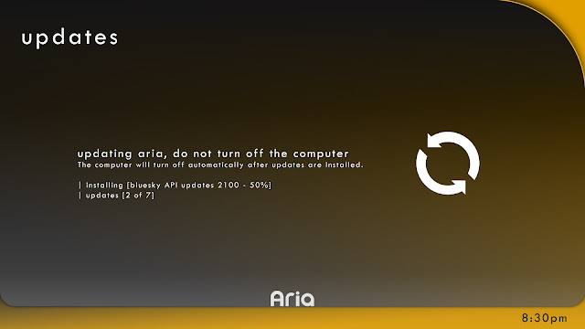
aria 2.3 or 8.2x (Which ever you called it)
 |
| It is always the redesigned boot screen. |
 |
| Take the approached from Windows 8 picture password screen. |
 |
| The desktop largely unchanged from 2.1 though the icons is redesigned. |
 |
| Still unchanged except the hardware "spec". |
 |
| Being direct is being well direct. just click/touch to go to the items you want fast. |
Labels:
aria OS,
Info,
Kami center,
Mini update,
Reloaded version,
Stuff
Customization
 |
| I like my desktop with a face staring at me all the time. Ok joking... |
 |
| Color if you like, any color range and etc. |
 |
| Customize everything. Make everything personal. |
 |
| Well that is unexpected.... |
Labels:
aria OS,
Design,
Mini update,
New design
The idea of aria.
Note: The Aria interface which I'm designing does not even come close to this video. :P
Being bored means try to duplicate the scene which only results in this..... Boot sequence in that video. (That's not my point, the video is awesome!)
Being bored means try to duplicate the scene which only results in this..... Boot sequence in that video. (That's not my point, the video is awesome!)
aria 2.1
 |
| Improved the start-up screen screen design. =) |
 |
| Cleaner login screen, in my opinion. |
 |
| The status is at the bottom, see the desktop on why I did this. |
 |
| Improved the desktop icons. More user friendly and the top bar and the side bar can be hidden. |
Labels:
aria OS,
New design
Settings app and weather app
 |
| I cannot stop repeating this; it is just plain simple. |
 |
| One touch airplane mode. |
 |
| Not too much info for your brains, just the essentials. |
kami music and kami center in landscape
 |
| Think of aria OS, only in a phone. Everything is the same. |
 |
| Oh look, panorama scrolling. |
 |
| The landscape mode looks very different from the usual portrait mode. |
Labels:
aria OS,
Kami center,
mobile,
mobile os,
Portrait
Subscribe to:
Comments (Atom)


