Seems that A.i.r design is getting abit slow.
I'm doing a tracing site for myself, that's why my interface designing, I mean A.i.r is designed slowly...
More to come don't worry. =)
http://sites.google.com/site/tracecgicharactors/Home
Lolz advertise my own site.
Don't worry, no ads in there.
Glassy, for a good cause

Only after I imported this wallpaper, then I realise that it's very transparent at the top. Inclusive of the menu and other stuff.
Take a look, in full HD design.
Nuff said.
Kami Center

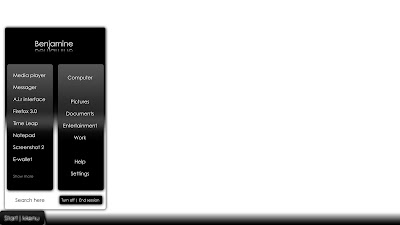
Kami Center, plain isn't? Clean is the best thing in interface designing.
Dirty can be an eye-sore.
*Note video names shown shows no preference about me watching it.
Names shown are purely given as an example. =P
THAT goes to all my older and newer post too.
Labels:
A.i.r,
Articina,
Kami center
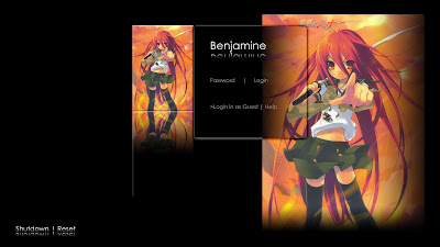
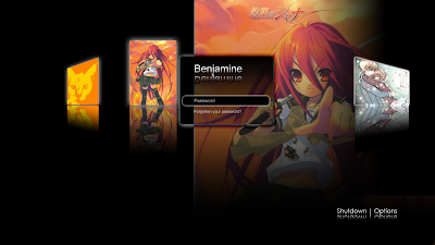
Login screen for A.i.r

What do you think?
You all should see my older design~~ :D
No more coverflow like design~~ muh hahaha!
So far.. my friend said it's plain, gotta try to make it even more eye candy!
Labels:
A.i.r,
Articina,
Kami Login
Sneak preview
I must be nuts on the previous post but hey, I'm gonna do that Login screen again!
Down draft idea , up realistic ideas!! Muh hahaha lolz
The main frame is up... more classy~~
Down draft idea , up realistic ideas!! Muh hahaha lolz
 |
| From Articina Interface designing |
The main frame is up... more classy~~
Nooooooooo.....
OMG... (>.<) A.i.r Login screen has GONE TOTALLY WRONG!!! Actually wanted to "copy" from Infomatics but decided to do a rewrite but this time it's worst then Infomatics!!!!!!!!!!!!!!!!!!!!!!!! x100 But the rest, menu and dockbar is ok. Infomatics demo might not be release to public. Or is it.. BTW the picture is larger then usual.
See? it's the worst login screen I have ever created!!!
Except the adorable Shana, overall design stinks!!
This is better~~ =D
 |
| From Articina Interface designing |
See? it's the worst login screen I have ever created!!!
Except the adorable Shana, overall design stinks!!
 |
| From Articina Interface designing |
This is better~~ =D
A.i.r
It's now being in progress.
Times waits for no one. I learned in one of the movies I brought back home.
Heart-touching movie.
Better be doing A.i.r now. See ya.
Times waits for no one. I learned in one of the movies I brought back home.
Heart-touching movie.
Better be doing A.i.r now. See ya.
The dairy of Articina
This is my summery of all my interface designing.
I shall begin explaining the milestone it has sat in my computer (lol).


Next is Articina design, as you can see the media center is actually from Kanami. This is a major improvment from OS1 which actually lacks more then 3 features that a user demands.
I shall begin explaining the milestone it has sat in my computer (lol).
It's holds everything together and while implementing the idea, why use 2 layers to hold everything together? So after days of cracking,
1)I found the answer to my needs, this is where Articina is born.
The first picture shows the Task Manager, in 3D. It shows the CPU usage and even shows the peak of the graph.
2)Second picture shows the Login screen, which changes after creating Articina and Infomatics, which is cool and nice. Ideas evolve even just by myself. Simple and sweet.
3)Next is the UAC, User Account Control. You might heared about this in Mac OSX and Vista.
However, in this picture, it's a little extreme as it shows the code and commands of a program that you might tried to run on your computer. Hope Microsoft or Apple or even open source OS community adopt this idea into their comsumers machine as I felt that it's a nice neat feature, although neardy. This keeps your computer safe and as well as the freedom of experimenting risk.
4)Last in the line of OS1, media center. Not much but neat. Needs alittle touchup though. =)


Next is Articina design, as you can see the media center is actually from Kanami. This is a major improvment from OS1 which actually lacks more then 3 features that a user demands.
1) This media player from Articina looks kinda familiar, nevermind about that. Moving on.
2) The login screen is a classic. Big improvment since OS1 and it's clean.But not clean enough and later we go on to the Infomatics.=)
3)The so called "explorer". My friend commented it and said it's nice but it's not really for the consumer level as it's too detailed. Too much information can kill brain cells; nuff said.


I'm proud of Infomatics. The biggest change in the two version I have created.
1) You see the media center, it just looks great. All-in-one entertainment center with details and information that you want to see, get reminded the last task you did and continue with it or just simply move on to other stuff.
2) The version 0.3. It is different from version 0.1-0.2 shown in my older post but this is a eye-catching feature that you should not miss. My friend said it looks like a cover-flow. Yes but no.
Yes it looks and slide like a cover flow but something is added on. Fading of the background and continuous loop when there are more then five account. Fun when it's really a login screen.
Well this is the end of my diary post of Articina.
Hope you like my designs. Thanks for visiting and have a goodday/night.
Labels:
Articina,
Infomatics,
Kami center,
Kami Login,
News,
Notices
i,Infomatics
 Infomatics, best of both design I created.
I am really excited to show any interested people as it's really realistic as in you can click on it as a real operating system, but it's not. =D
So far after making my first interface, OS 1 and the next interface design , Articina, Infomatics are both and more. So much cleaner and fresher, after self-learned from Articina and some feedback from my friends and pals, it's just look great.

And of course, it adopts some of the "features" of
Kanami design.Fresh mediaCenter looks (as far better then Kanami itself =x).
If you people (designers and some related interface project whatsoever) feel it's nice, learn from here, adopt it in your programs or even make a skin for other operating system.Even better, intergrate the idea in your operating system.But notify me first =D
I must be crazy but design is @ my beta stage.


Labels:
Articina,
Infomatics,
Kami center
Dammed...
Uploading the Articina interface is a pain...
Although it's a small size.. you can see 21MB can >clog< your skydrive account.
zzz...
Details: Articina interface version 9, Interface version 8.2
Tomorrow I try to upload again...
Although it's a small size.. you can see 21MB can >clog< your skydrive account.
zzz...
Details: Articina interface version 9, Interface version 8.2
Tomorrow I try to upload again...
Subscribe to:
Comments (Atom)


